Guide 101:Material Design in Android App Development

Tags
 Stay In-the-loop
Get fresh tech & marketing insights delivered right to your inbox.
Share this Article
Category
- .Net Developer
- Adtech
- Android App Development
- API
- App Store
- Artificial Intelligence
- Blockchain Development
- Chatbot Development
- CMS Development
- Cybersecurity
- Data Security
- Dedicated Developers
- Digital Marketing
- Ecommerce Development
- Edtech
- Fintech
- Flutter app development
- Full Stack Development
- Healthcare Tech
- Hybrid App Development
- iOS App Development
- IT Project Management
- JavaScript development
- Laravel Development
- Magento Development
- MEAN Stack Developer
- MERN Stack Developer
- Mobile App
- Mobile App Development
- Nodejs Development
- Progressive Web Application
- python development
- QA and testing
- Quality Engineering
- React Native
- SaaS
- SEO
- Shopify Development
- Software Development
- Software Outsourcing
- Staff Augmentation
- UI/UX Development
- Web analytics tools
- Wordpress Development
Embodied by Google, Material Design transcends mere aesthetics—it’s a symphony of visual allure and seamless functionality. This guide delves into the core principles that breathe life into Material Design, emphasizing tangible, intuitive experiences in Android app development.
From the deliberate use of color and typography to the artful dance of motion, every aspect serves a purpose. Beyond surface-level appeal, Material Design extends into metaphorical interaction, mirroring physicality to champion clarity, simplicity, and purpose.
Go through our blog as we explore the depths of Material Design, unlocking the secrets to crafting user-centric, harmonious, and engaging digital environments in Android app development.
A Brief on Material Theme and Widgets in Android App Development
Crafting Material Design in Android App Development
- Key Components
- Color Palette and Theming
- Typography
- Motion and Animation
- Layout and Grids
- Responsive Design
- Material Theming
- Accessibility Guidelines
- Testing and Optimization
- Staying Updated with the Latest Design Trends
A Brief on Material Theme and Widgets in Android App Development
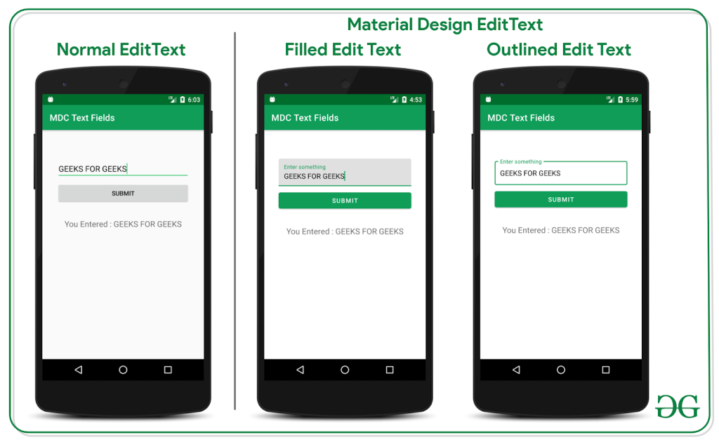
In the realm of Android app development, the Material Theme serves as a design language, ensuring a consistent and visually pleasing user experience. Its modular components and vibrant color palette empower developers to craft intuitive interfaces. Widgets, integral to this framework, extend functionality and interactivity.
Leveraging Material Theme’s adaptable elements, developers can seamlessly integrate widgets, enhancing user engagement and streamlining navigation. This dynamic synergy between theme and widgets not only elevates aesthetic appeal but also fosters a user-centric approach, where form seamlessly aligns with function, culminating in a polished and user-friendly application.
RELATED READ: Flutter App Development Widget Guide: Stateful or Stateless?
Crafting Material Design in Android App Development
Key Components
Devising a seamless user interface demands meticulous attention to key Material Design components. Buttons serve as tactile entry points, influencing user interaction. Employ them judiciously, utilizing elevation and color to signify hierarchy.
Tabs, pivotal for navigation, demand an intuitive arrangement, promoting a fluid user journey. Opt for dynamic transitions and bold indicators to enhance usability.
Cards, a visual cornerstone, amalgamate information elegantly. Ensure harmonious shadows and spacing for depth, promoting visual hierarchy. Seamless card transitions contribute to a cohesive UI. Unify these elements through consistent typography and color palettes, forging a visual language that resonates.
Employ motion wisely, imbuing functionality with polished finesse. Striking this balance in your design implementation cultivates an authoritative UI, elevating user experience to an artful synthesis of form and function.
RELATED READ: 2024 Vision: Unveiling the Next Wave of UI/UX Design Trends
Color Palette and Theming
In material design, color serves as a crucial element, transcending mere aesthetics to influence user experience profoundly. A thoughtfully chosen color palette establishes visual hierarchy, aids in navigation, and conveys information seamlessly.
Selecting a palette involves more than personal preference; it requires an understanding of color psychology and its impact on user emotions. Harmonizing primary and accent colors ensures a cohesive interface, while contrast enhances readability and engagement.
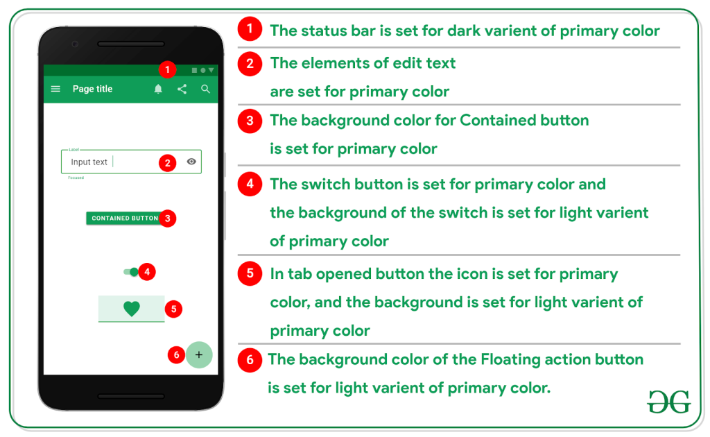
To choose an effective color palette, consider the brand identity, cultural associations, and accessibility standards. Applying theming involves extending the chosen palette to various components, maintaining consistency across the app or website. Thoroughly test color combinations to ensure readability for diverse users.
In material design, color isn’t just about visual appeal; it’s a strategic tool shaping user interactions and perceptions. Choose and apply your color palette with precision to elevate the user experience and reinforce your design’s functionality. Moreover, collaborate with Android app experts to refine color palette, ensuring the material design’s beauty in UI/UX.
Typography
In crafting an authoritative visual language through material design, font selection becomes paramount. Opt for fonts with strong personalities that align with your brand ethos. Balance aesthetic appeal with readability; prioritize legibility across various devices and screen sizes. Maintain consistency by limiting font families and weights to foster a cohesive user experience.
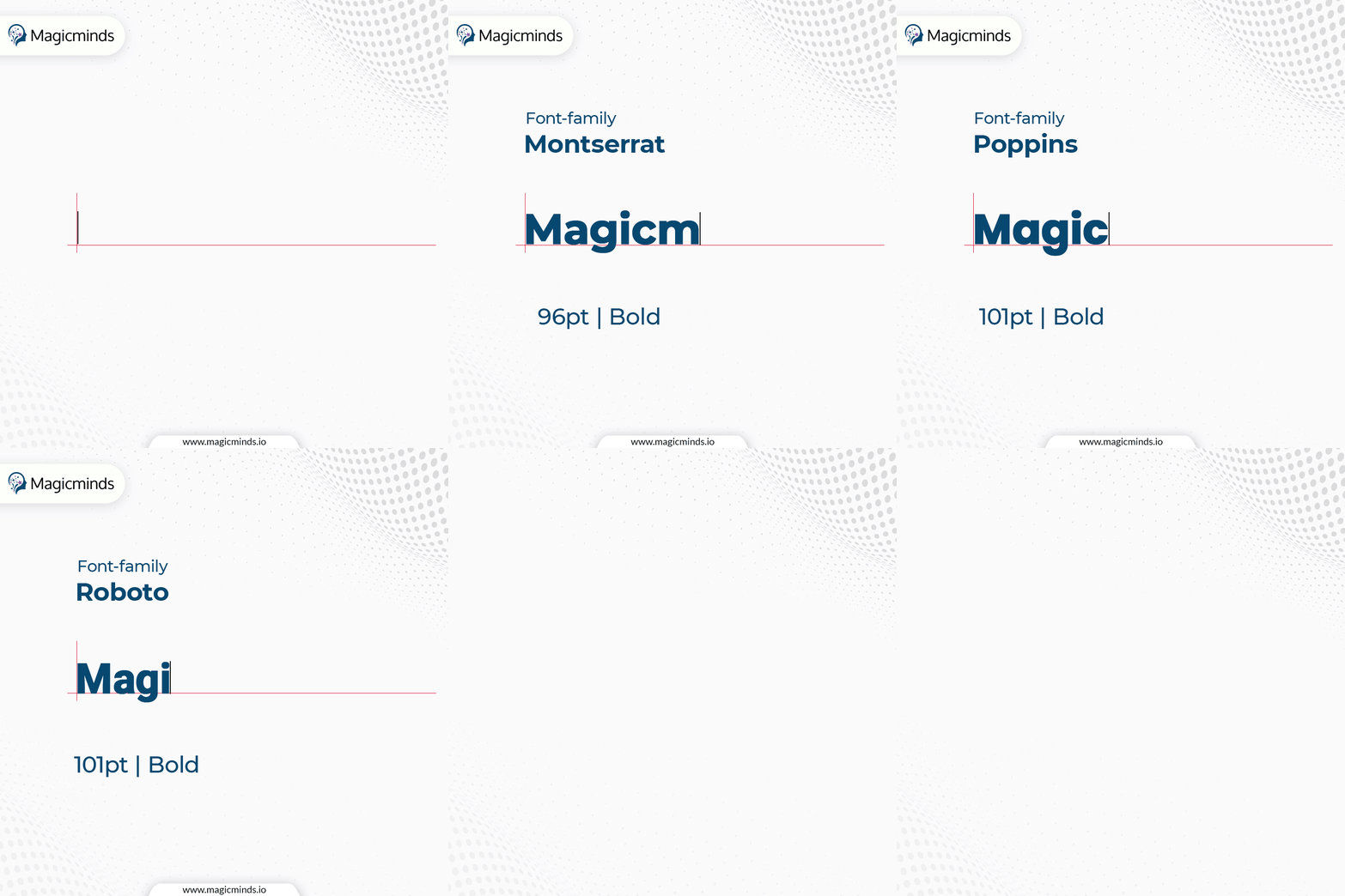
Embrace typographic hierarchy to guide users seamlessly through content. Leverage font size and spacing judiciously; prioritize clarity without sacrificing style. Consider cultural implications, ensuring fonts resonate universally.
Regularly assess font performance on diverse platforms to uphold a seamless design language. Through meticulous font curation, material design transcends aesthetics, forging a visually commanding and user-centric interface.
RELATED READ: Typography in UX Mastery: Design Empowerment Guide
Motion and Animation
The strategic incorporation of motion transcends mere aesthetics, evolving into a pivotal element for an unparalleled user experience. Dynamic animations serve as a navigational guide, seamlessly connecting user actions with system responses.
By judiciously implementing smooth animations, developers elevate the tactile interaction, fostering a sense of continuity and responsiveness. This not only imparts a visually appealing dimension but also enhances cognitive fluidity, reducing perceived load times.
Thoughtful integration of motion elements amplifies the intuitive nature of interfaces, ensuring that transitions are not just visually pleasing but functionally purposeful. Striking a balance between elegance and functionality, the role of motion in Material Design is unequivocal—a dynamic conduit for heightened user engagement and satisfaction. Android mobile app developers excel in crafting captivating motion and animations for material design UI/UX, therefore, collaborating with such expertise is beneficial in a positive outcome.
Layout and Grids
Harnessing the power of grids serves as an authoritative cornerstone for crafting consistent and adaptive layouts across diverse screen sizes. Grid systems, with their inherent structure and precision, empower designers to orchestrate content placement with finesse. By embracing the fluidity of responsive grids, a website seamlessly adjusts its presentation, ensuring a harmonious user experience across devices.
This strategic utilization of grids transcends the mere aesthetic; it becomes a formidable tool for maintaining brand identity and enhancing usability. Skillful implementation of breakpoints within the grid allows for dynamic responsiveness, gracefully accommodating the intricacies of various screens. Through this disciplined approach, designers wield grids as instruments of control, sculpting interfaces that not only captivate visually but also deliver optimal functionality across the expansive landscape of digital devices.
Responsive Design
Ensuring seamless responses across diverse devices demands meticulous attention. Material Design, the epitome of Google’s design philosophy, accentuates user experience. To navigate the intricate landscape of orientation changes gracefully, employ robust lifecycle management. Harness the power of fragments to modularize UI components, allowing for flexible adjustments during orientation shifts.
Implement responsive layouts utilizing ConstraintLayout, optimizing UI elements for various screen sizes. Leverage resource qualifiers judiciously to tailor layouts for distinct device configurations. Rigorous testing on a spectrum of devices, coupled with adaptive design principles, guarantees a harmonious user experience.
RELATED READ: UX Mastery: A Blueprint for Mobile App Development Success
Material Theming
Crafting a distinctive visual identity within Material Design parameters demands a strategic fusion of brand essence and design principles. Begin by immersing yourself in your brand’s ethos, extracting core visual elements that resonate. Integrate these seamlessly into Material Design’s framework, ensuring harmony and coherence. Embrace color psychology judiciously, selecting a palette that reflects your brand’s personality while adhering to Material Design’s vibrancy.
Tailor typography to convey your brand’s tone – bold, playful, or sophisticated. Unify iconography with brand symbolism, forging a visual language that communicates purposefully. Elevate beyond standard components by injecting bespoke elements, imparting an exclusive touch.
Leverage motion design to enhance user engagement, adhering to Material Design’s fluidity. Iterate relentlessly, refining until a unique synthesis of brand identity and Material Design finesse emerges, providing users an immersive, cohesive experience.
Accessibility Guidelines
In crafting an inclusive UI/UX, prioritizing accessibility is paramount. Begin by conducting thorough user research, actively involving individuals with diverse abilities. Implement meaningful alt text for images, ensuring screen readers convey content accurately. Employ robust color contrast ratios for readability and accommodate various input methods, acknowledging motor impairments.
Prioritize keyboard navigation, guaranteeing seamless interaction for those reliant on it. Leverage ARIA landmarks to enhance screen reader navigation within complex interfaces. Conduct rigorous usability testing with diverse user groups to refine the design iteratively. Foster an inclusive mindset among your team, emphasizing the ethical imperative of accessibility.
Regularly update your knowledge on evolving accessibility standards, staying ahead of industry advancements. Inclusive design isn’t merely a checkbox; it’s a commitment to equitable user experiences for all. To have a cherry on the cake, seek skilled Android app developers to hire to ensure adherence to accessibility guidelines in material design.
Testing and Optimization
Elevating Material Design implementations to ensure optimal performance demands a meticulous approach. Employing advanced testing tools is imperative to validate the integrity of your design. Utilize the Accessibility Scanner to assess adherence to accessibility guidelines, ensuring an inclusive user experience.
Leverage the Performance Profiler in Android Studio for in-depth analysis, identifying bottlenecks and optimizing code execution. Conduct real-time testing on various devices using Firebase Test Lab to uncover device-specific nuances that may impact performance.
Implement the Motion Editor in Android Studio for nuanced animation adjustments, contributing to a seamless user journey. Employ the Layout Inspector to scrutinize view hierarchies, ensuring efficient layouts and responsive design.
Continuous integration with tools like Jenkins or Travis CI facilitates automated testing, ensuring consistency across iterations. Embrace the synergy of these tools and techniques to fortify your Material Design implementation, delivering a refined and high-performance user experience.
Staying Updated with the Latest Design Trends
To stay current with the latest material design trends in Android app development, regularly consult Google’s official Material Design guidelines. These authoritative resources provide insights into evolving design principles, components, and patterns.
Additionally, explore reputable design blogs, attend Android-related conferences, and follow leading designers on social media platforms for real-time updates and community discussions.
Continuous engagement with these sources ensures a thorough understanding of the latest trends, empowering you to create visually appealing and user-friendly Android applications aligned with the industry’s best practices.
Embrace the adaptive capabilities of Material Design, empowering your app to elegantly traverse the variances of device dimensions and orientation changes. Mastering this art ensures your app’s authority in delivering a polished and consistent user interface across the Android ecosystem.
