UX Mastery: A Blueprint for Mobile App Development Success

Tags
 Stay In-the-loop
Get fresh tech & marketing insights delivered right to your inbox.
Share this Article
Category
- .Net Developer
- Adtech
- Android App Development
- API
- App Store
- Artificial Intelligence
- Blockchain Development
- Chatbot Development
- CMS Development
- Cybersecurity
- Data Security
- Dedicated Developers
- Digital Marketing
- Ecommerce Development
- Edtech
- Fintech
- Flutter app development
- Full Stack Development
- Healthcare Tech
- Hybrid App Development
- iOS App Development
- IT Project Management
- JavaScript development
- Laravel Development
- Magento Development
- MEAN Stack Developer
- MERN Stack Developer
- Mobile App
- Mobile App Development
- Nodejs Development
- Progressive Web Application
- python development
- QA and testing
- Quality Engineering
- React Native
- SaaS
- SEO
- Shopify Development
- Software Development
- Software Outsourcing
- Staff Augmentation
- UI/UX Development
- Web analytics tools
- Wordpress Development
Mobile app designers and developers are tasked with the challenge of not just meeting user expectations but surpassing them. This blog delves into the crucial segment of mobile app development which is UI/UX design principles as they are responsible for your mobile app’s success. Before we dive into these principles, let’s take a moment to reflect on some crucial stats.
As stated by Business of Apps, on average, about 77% of daily active users tend to abandon an app within the initial three days following installation. However, this need not be the fate of your mobile app if you follow the UX design principles that are listed here.
UX Design Principles for Mobile App Development Success
#2 Content Prioritization / Decluttering
#4 Design Controls Based on Hand Position
#8 Ensure Intuitive Navigation
#9 Recognition Rather Than Recall
#10 Seamless User Flows and Interactive Design
UX Design Principles for Mobile App Development Success
#1 User Centric Design
User-centered design isn’t merely a facet of UX design; it’s a separate and vital strategy in mobile app design and development. It goes beyond designing for users and emphasizes designing with users.
This approach ensures that the resulting product not only meets but exceeds user expectations by actively involving users throughout the design process. The ultimate goal is to create a product that consistently delivers substantial value and evolves with user needs.
#2 Content Prioritization / Decluttering
In the world of UI/UX design and mobile app development services associated with it, the mantra ‘less is more’ holds great significance. With human attention spans at just 8 seconds, it’s crucial to engage users from the start.
Considering the inherent limitations of smartphone screens, the practice of cramming numerous elements onto a single screen is ill-advised.
- Focus on showcasing only the essential content and functionalities required by users in your mobile app development services.
- Secondary content should find its place in a menu, with an emphasis on progressive disclosure and straightforward terminology to eliminate potential confusion.
- Furthermore, prioritize the use of icons over text to declutter the interface.
#3 Provide User Control
Where did that file go? Did I delete it by accident?‘ — we’ve all had these moments!
The ability to backtrack, undo actions, or modify information is vital for effective usability. Google Drive, for instance, excels in this aspect by promptly notifying us when an action is completed and offering an option to reverse it, especially if it was unintentional. This mobile UX design and development principle is integral to delivering a superior user experience.
- Empower app users to shape their path and make decisions aligned with their preferences.
- Provide control over notifications, flexibility in adjusting settings, and the capability to block actions as needed.
- Offer informative feedback without interrupting their workflow, fostering transparency, and granting users a sense of autonomy and control.
RELATED READ: Green IT in Mobile App Development: 7 Best Practices
#4 Design Controls Based on Hand Position
Designing controls based on hand position is a crucial UI/UX design principle. It acknowledges that users interact with mobile devices in various ways, including one-handed and two-handed grips.

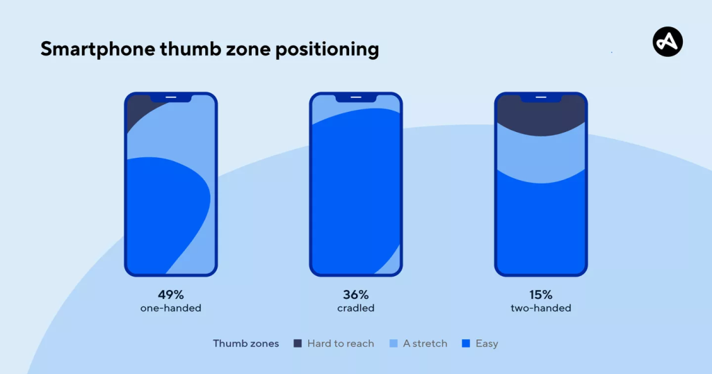
Steven Hoober’s findings indicated that 49% of smartphone users opted for a one-handed grip, 36% used both hands but primarily interacted with just one thumb or finger, and 15% preferred the use of both thumbs.

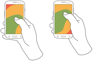
In this visual guide below, green signifies easily reachable areas, yellow represents zones requiring a slight stretch, and red designates regions necessitating a shift in how users hold the device.
- Position top-level menus, frequently-used controls, and common actions within the green zone for easy one-thumb access.
- Keep less frequently-used or potentially consequential actions (e.g., delete or erase) in the hard-to-reach red zone to prevent accidental triggers.
#5 Consistency and Standards
Mobile app development demands consistency, a fundamental UX design principle. Users engage with various apps, and your app should align with common UX patterns in this diverse landscape.
Users prefer predictability and familiarity in mobile app design and development. They want to efficiently accomplish tasks with a clear understanding of how the app works, even after some time.
The swiftest route to achieve this objective involves—
- Aligning your product with the conventions and practices commonly employed in similar products.
- Conducting a competitive UX analysis proves instrumental in identifying these shared patterns.
#6 Legible Text Content
The choice of typography during your mobile app designing and development phase holds immense significance in crafting a positive UX. At the core of mobile app typography lies the crucial element of readability. If your app’s content is irrelevant to users, its very existence loses purpose.
- Find the right balance between readability and space efficiency.
- Text smaller than 16 pixels is hard to read on mobile screens, while overly large fonts lead to frustrating hyphenation issues.
- Opt for a font size that’s easy to read without zooming, and stick to simple, conventional fonts like Roboto or Helvetica Neue. These fonts combine functionality and visual appeal effectively.
RELATED READ: Guide 101: Push Notifications in Mobile App Development
#7 Minimize Data Input
Users perpetually seek shortcuts and streamlined methods for accomplishing tasks. Assist them in reducing typing efforts by
- Simplifying forms
- Eliminating unnecessary data input fields
- Offering ‘remember me’ options for future use
- Implementing autocomplete
- Showcasing recent search history
- Utilizing location detection to curtail data input requirements
- Using autocomplete for smart suggestions
- Employing field check features with colors or special characters to highlight missed fields.
- Offering keyboard customization for swift input selection, such as using a numeric keypad for numeric input.
#8 Ensure Intuitive Navigation
Specifically in the case of eCommerce mobile app development, navigation should prioritize simplicity and intuitiveness. It is imperative that users can effortlessly transition between screens or return to the home screen without encountering hurdles.
Users, in their interaction with apps, are typically disinclined to invest time and effort in deciphering complex sequences of steps to achieve their objectives. If an action demands excessive time or effort, users are inclined to abandon the app, seeking more user-friendly alternatives. Thus, establishing a coherent and structured framework within your app is extremely crucial.
#9 Recognition Rather Than Recall
Recall involves the mental process of recollecting details such as where you left off, recent interactions, or how to perform specific tasks. On the other hand, recognition entails the ability to identify cues that guide users toward appropriate actions.
Recognition is notably more user-friendly, as it allows the brain to function in the moment without sifting through memory for solutions.
For instance, the incorporation of icons in a user interface holds substantial power due to its capacity for instantaneous symbol recognition. When a familiar warning sign icon appears in a dialog, it immediately grabs the user’s attention, signaling potential danger ahead.
However, if an icon is crafted to compel users to recall and interpret its meaning, it diminishes both efficiency and user-friendliness.
#10 Seamless User Flows and Interactive Design
User flows represent a granular depiction of all the actions an user can undertake within the app to accomplish crucial tasks. UX Designers possess the capability to craft user flows that are not only intuitive but also align with the core problems the app addresses for its users.
Integrate interactive UI elements such as images, videos, animations, and micro-interactions that can substantially enhance user engagement within the app.
#11 Test Your Design
After crafting an impeccable user navigation system and applying a discerning UI/UX design perspective, you may feel delighted with your app’s functionality. However, it’s important to recognize that this marks just the initial phase.
- Prior to the app’s launch, go for beta testing that can pinpoint and address any potential issues.
- Subsequently, post-launch, conducting regular testing across various user touch points within your app is crucial for identifying areas in need of enhancement.
RELATED READ: 2023 Mobile App Development Security: Essential Guidelines
Wrapping Up
In mobile app development, UI/UX principles are our roadmap to success, forming the foundation of exceptional experiences. These principles, including user-centric design and streamlined interfaces, are the foundation of exceptional mobile app experiences. Whether you’re embarking on a new venture or enhancing an existing one, these principles should always be in your toolkit. A proficient mobile app development company usually looks after all these measures and best UX design practices while building mobile apps, ensuring the best results for their clients.


