Typography in UX Mastery: Design Empowerment Guide
Tags
 Stay In-the-loop
Get fresh tech & marketing insights delivered right to your inbox.
Share this Article


Category
- .Net Developer
- Adtech
- Android App Development
- API
- App Store
- Artificial Intelligence
- Blockchain Development
- Chatbot Development
- CMS Development
- Cybersecurity
- Data Security
- Dedicated Developers
- Digital Marketing
- Ecommerce Development
- Edtech
- Fintech
- Flutter app development
- Full Stack Development
- Healthcare Tech
- Hybrid App Development
- iOS App Development
- IT Project Management
- JavaScript development
- Laravel Development
- Magento Development
- MEAN Stack Developer
- MERN Stack Developer
- Mobile App
- Mobile App Development
- Nodejs Development
- Progressive Web Application
- python development
- QA and testing
- Quality Engineering
- React Native
- SaaS
- SEO
- Shopify Development
- Software Development
- Software Outsourcing
- Staff Augmentation
- UI/UX Development
- Web analytics tools
- Wordpress Development
Welcome to the captivating world of digital design, where every curve, line, and stroke of a letter holds the key to an immersive user experience. Typography in UX is the unsung hero that bridges the gap between your audience and your design, conveying emotions and feelings with each carefully chosen letter.
Efficient typography can emphasize usability with eye-grabbing and compelling UX design that mobile app development companies build, assisting businesses in increasing their conversion rate.
In this blog, we’re delving deep into the art and science of typography in UX or web design. It’s not just about aesthetics; it’s about creating a symphony of readability, persuasion, understanding, relevance, and effectiveness. When mastered, typography transforms your design from a mere visual treat to an experience that resonates, putting your users at ease and leaving them craving more.
What is Typography in UX Design – A Quick Look
How Choices of Typography in UX Can Influence User Perception and Experience?
Basic Principles of Typography in UX Design You Must Follow
What are the Impacts of Typography on UX Design?
List of Some Major Font Styles
What is Typography in UX Design – A Quick Look
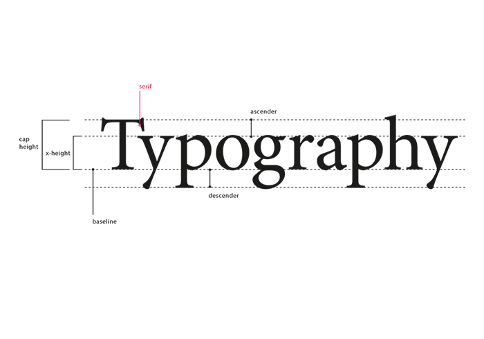
Typography in UX involves a design structure where typefaces are organized in a way that provides readable and enhanced user interfaces or experiences.
Typefaces are considered the ‘font’ family and define physical letter block faces. A typeface comprises fonts, just like a book consists of chapters and involves multiple font weights, characters, numbers, and symbols. Take, for example, Georgia, Arial, Times New Roman, Roboto, and Comic Sans, all typefaces.
How Choices of Typography in UX Can Influence User Perception and Experience?
What is the impact of typography on design? Typography is an essential skill that every designer must have. It certainly includes choosing the right fonts for the UX design. Let’s learn the influence of fonts on user experience.
Establish Connection
A well-chosen font communicates with the users well. The real purpose of UX designers is to create text with appropriate fonts that users can understand and comprehend more quickly than ever.
It Creates Trust
Your chosen fonts are an excellent tool for building trust in users. As users connect with your brand’s message and values, it amplifies their trust in it, evoking emotion.
Emphasizes Brand Relationship and Recognition
Why do font choices matter? Indeed, your font choices are vocal for the brand identity and personality. If users understand and benefit from the mobile app or website’s UX design, there’s a high chance that they will return to your brand repeatedly. This emphasizes the brand’s relationship with users and enhances the brand’s reputation and image.
Basic Principles of Typography in UX Design You Must Follow
Till now, we talked about a general overview of typography in UX design, but what are the principles of typography? Below are certain principles you need to follow while creating a website or mobile app.
- The first mantra is to keep it as simple as possible. Using too many typefaces takes space, not to mention the application loading time. So, do stick to three to four typefaces that do not lead to confusion and are available at the user’s end.
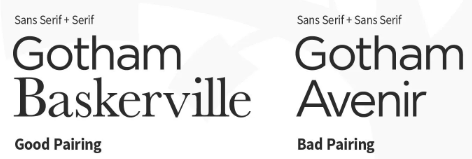
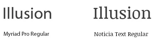
- To maintain the nuances of the typefaces, ensure your selected typefaces don’t match. You can create contrast using one font as a serif and another as a sans serif. Let’s understand this with a picture.
- You must prioritize the readability, legibility, and accessibility of the typeface in mind. You must consider the environment and medium of the users and also use proper color contrasts that soothe the eyes.
- Your motto is to make the readers look into the text and understand the information quickly. Prioritize the text information and arrange it accordingly. Remember that color, size, and weight matter significantly, creating a visual hierarchy and improving SEO.
- You should design a UX that would be used both on the website and mobile. You need to craft the typography in a way that fits into both of these platforms, and users can use it with ease. So, scale up the typography across different screen sizes.
- As mentioned earlier, typography is a medium to communicate with users through visual language. Hence, the color, forms, and patterns should set the proper mood and tone, enhancing the brand value. Let’s check some successful examples.
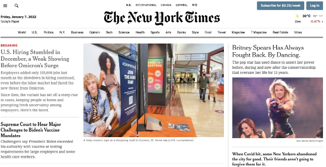
The New York Times adopts calligraphy as its logo and, for headlines, uses a serif font, providing a classic, enhanced, and hard copy newspaper.
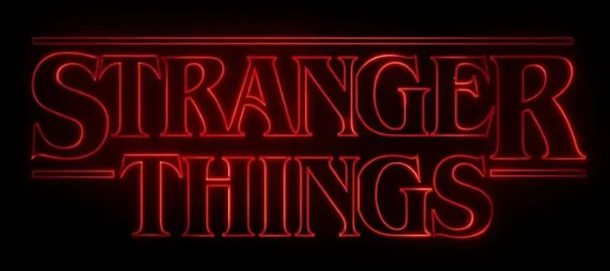
Netflix uses the right color and typography to create a vibe and mood through web series titles.
Last but not least, you must test and learn. Check out different typefaces and fonts and understand how they are working. With extensive test formulas, you can learn and implement new constructive designs in UX, which supports better mobile app development.
What are the Impacts of Typography on UX Design?
Now, why is typography important in UX design? This is a common question we get. The importance of typography in UX design is huge. Let’s uncover the impacts of typography on UX design.
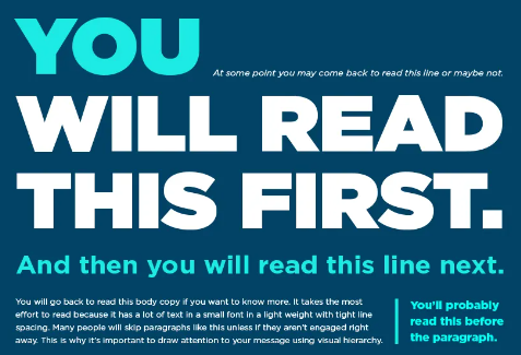
Establish the Hierarchy
Typography is the best choice to add a visual hierarchy that impacts the user’s attention while conveying critical information properly. Designers draw attention to the essential headings, subheadings, and key points using color, font size, style, etc. This, of course, assists users to scan the text information, understand it quickly, and find what answers they’re looking for.
Eased Readability and Comprehensive
What is the impact of font style? Well, a clear and concise typography is paramount for increasing readability. A good font with proper letter spacing and line heights conveys users the exact information of the text. The clear and precise appearance of Sans-serif fonts makes it widely adopted in digital interfaces.
Besides, the screen size matters. For instance, while reading in a mobile app, if you provide larger fonts, that might help them without straining their eyes. Similarly, on a desktop, slightly smaller fonts can be a good choice for screen accommodation.
Own the Brand Identity
Typography is a great tool for creating brand identity. Fonts speak different personalities that certainly convey emotions in users. To establish the brand’s identity, businesses must choose proper typography that aligns with the brand’s value and image, crafting brand identity.
For instance, mobile app development services can use a playful script font to provide warmth and friendly nature, whereas a bold and sleek font voices professionalism and an authoritative tone.
Accessible and Inclusiveness
Regarding accessibility and inclusivity, the rightly chosen font plays a pivotal role. Want to know how?
Take, for example, some users who might be suffering from visual impairment or dyslexia disease and find it very challenging to read the dedicated mobile app developer-built fonts. Hence, you must introduce adjustable fonts for all, especially paying more attention to dyslexia-friendly fonts that enhance the user experience.
RELATED READ: 2024 Vision: Unveiling the Next Wave of UI/UX Design Trends
Faster Loading Speed
Users always prefer faster loading speeds with the smooth performance of mobile apps or websites. In that scenario, think how frustrating they might feel if your custom or heavily chosen fonts are slowing down the performance and loading speed. Sounds too boring. Hence, you must be well aware of the fonts you’re using, employing font subsets that decrease the file size and support faster loading speed.
Cultural Maintenance
If you’re designing typography in UX design for international users, cultural considerations should be a good practice. Your chosen fonts might have different meanings and sentiments for users across the globe. So, conduct extensive research and use those fonts that go with your worldwide user’s preference and expectations, respecting and maintaining the cultural nuances.
Consistency in Typography
Maintaining consistency in typography is the best thing you can implement in the UX design. If you possess the uniformity of font choice, style, and format, your users can quickly connect with your brand’s personality, fostering your brand’s growth no matter which platform they’re using.
Add Aesthetics
A well-chosen typography can add aesthetic vibes to your text information or UX design even though you’re running out of good graphics. Some brands are adopting good typography to eliminate graphic and animation distractions, still maintaining the nuances of ‘looking good’ vibes.
Improved Conversion Rate
As mentioned above, if you choose a proper typography, your users can better understand the text information. Needless to say, the more reach you get through your text information convey process, the more CTA, this improved conversion rate, or revenue you earn.
RELATED READ: UX Mastery: A Blueprint for Mobile App Development Success
List of Some Major Font Styles
Till now, we discussed the impacts of typography on UX design and users. But what fonts are crucial in improving the communication process alongside the brand’s identity? Let’s delve into some of the major font styles.
Serif
The serif font style aligns with the books and physical media. The subcategories of this font include Old Style, Slab, Transitional, Modern, and Glyphic. Its wide usage in academic and formal institutes has made it immensely popular.
Which adjective defines serif fonts?
- Conservative
- Respectable
- Reliable
- Elegant
- Sophisticated
Examples: Times New Roman, Georgia, Palantino, and Garamond are the best examples of serif fonts.
Sans-serif
Sans-serif is perfectly suitable for its modern approach. As this font’s letter takes less space, it can be implemented in modern devices easily. With its straightforward agenda, it embodies clean and clear text. The subcategories of sans-serif are Square, Geometric, Humanist, and Grotesque.
What are adjective attributes in sans-serif fonts?
- Modern
- Clarity
- Clean-looking
- Efficient
- Straightforward
Examples: The best examples of sans-serif are Arial, Calibri, Helvetica, and Futura.
Script
If you’re looking for casual yet creative fonts, script fonts are best suited. Using their unique designs, you can flaunt your messages smoothly. It voices a familiar, dedicated, personal, and elegant approach due to its calligraphy art feature. The subcategories include Formal, Casual, Blackletter, and Calligraphic.
What defines a script font?
- Uniqueness
- Emotional
- Personal
- Creativity
- Elegance
Examples: Tangerine, Pacifico, Lobster, and Alex Brush are the best examples of script fonts.
Decorative
For advertising purposes, nothing is better than a decorative font. This font amalgamates uniqueness and creativity to form a new yet alluring result.
What are the characteristics of a decorative font?
- Casual
- Creative
- Urban
- Flexible
- Original
Examples: Phosphate, Graffiti, Grunge, Stencil, and Chalkduster are the best-suited instances of decorative fonts.
Roboto
Many dedicated mobile app developers extensively choose Roboto due to its friendly appearance and open curve. Roboto is preferred by Google for mobile operating systems in Android devices as the primary font.
Poppins
Poppins is a good choice for developing a good UI UX design due to its lively feel, providing comfort in reading anything to users.
- Although good typography adds aesthetic and evokes in users, never and ever use more than three different fonts in your UX design. This makes the website or mobile app look unstructured and creates havoc. So, practice using minimum fonts, and remember, multiple font sizes and styles can also cause a wreck in your design.
- Choosing the proper amounts of characters in text information is important. It’s the legibility that impacts your brand’s image. So, keep the characters within 60 per line, limiting the line length or width of the text.
- Avoid using all caps or capitalized letters in your text information. If the text information includes reading any piece for the user, don’t use caps as it might not look good and hinder the aesthetic of the information, causing stress in their eyes.
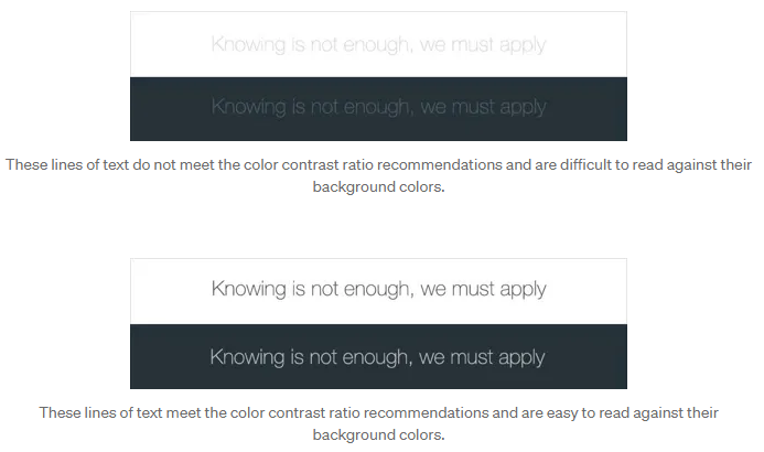
- Believe it or not, color contrast plays a pivotal role in attracting user’s attention, providing them with the information they’re looking for. Avoid using the same colors in the background and text. Remember, the easier it is for your users to scan the text and read it, the more benefit you get.
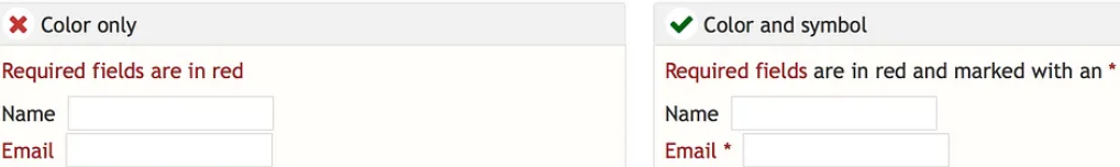
- Don’t use red or green text, which hinders distinguishing important information for color-blind people.
- Remember to eliminate the practice of using blinking or flash text as it might trigger individual users to have seizures. Besides, this can be very irritating and distracting for the users.

- You can go for any font that has extensive library service support. This might help your designers to develop typography in UX design.
- Understand what your brand is up to the motto and your target users first. Research that and choose proper fonts with accurate size, style, and colors that align with your brand’s personality, providing you with more reach.
- Some typography must be more transparent in similar letters, such as ‘i’ and ‘l’s. So, when selecting fonts, ensure that the similar letterforms are distinguishable.
Wrapping Up
Typography in UX design is the coolest yet robust tool to enhance and increase the user experience in the digital design world. From increasing readability and comprehension to creating a visual hierarchy that emotionally engages audiences, thought-provoking and constructive UX design can transform mobile app development and take good UX design to an exceptional stage. Besides, proper communication that sets the right tone and mood, faster loading speed, and more assists users to enjoy a compelling experience while establishing brand identity and value and thus unlocks improved revenue.